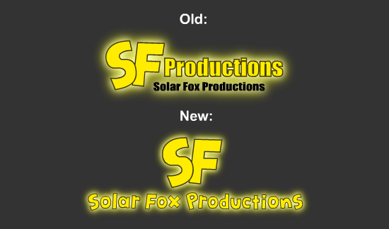
For people who are interested to know, I decided to change my SolarFoxProductions logo for the first time in many years. I completely redesigned the text and the position of the 'SF'. I still didn't want to modify the 'SF' specifically though, since pretty much everyone who knows me on the internet is familiar with that part of the logo.
I've been wanting to change it for a while now. Especially the areas on the old one where it says "Productions" two times. It just seemed kind of redundant to show the same words twice. I also think the new yellow text looks way better than the generic black text which doesn't really blend well with the logo.
I might make a few minor changes to it, but so far, I like how the new logo looks overall and will most likely be using it from here on. You guys can tell me what you think of the new one by commenting below.

thece
while i like the older one more,due to it cleaness,the new one is cool too
SolarFoxProductions
Thank you for your opinion on it.